Monday, May 19, 2014

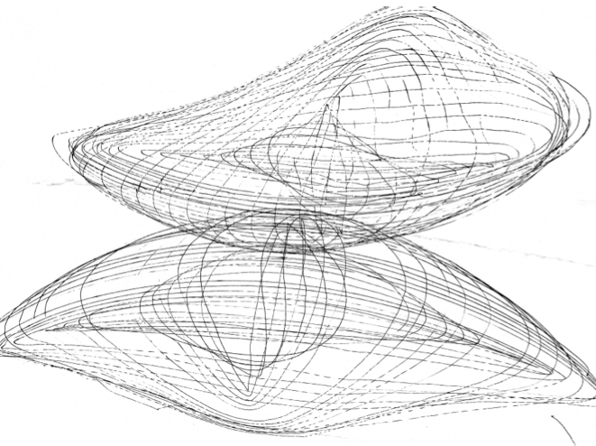
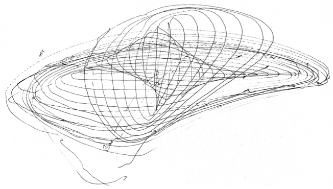
Hand-Cranked Harmonograph at the Maker Faire

I had a great time exhibiting my Exploratorium prototype at the Maker Faire last weekend. The flow of visitors passing by our table was continuous and almost never-ending (as there were a lot of people in general who visited the Exploratorium tent.) I almost lost my voice a second time from talking too much. The visitors were very engaged and both the adults and the children asked great questions!

There was a particularly curious child who wanted to try out all possible combinations: "What if we put the pin in this hole instead?" "What if we use a smaller gear?" "What if we use a bigger gear?" "What if we use the biggest gear possible?" "What if we use different arms?" It was fantastic seeing him and many others so curious to experiment.

I also had the chance to talk to Paula from the Exploratorium who coincidentally had brought a spirograph exhibit to show after our shift, and we had a great conversation about spirographs, my harmonograph design, and some general topics such as digitial-physical interfacing.


Wednesday, April 9, 2014

The Wax Waterfall

What happens when you give 152 Crayolas (the biggest box they make with every color imaginable) and a device that melts crayons to a bunch of museum-goers?

As part of a class project designing exhibits for the Exploratorium, I wanted to explore the medium of wax.  While typically dripping wax is a nuisance – especially when it comes to candles – it can be nonetheless absolutely mesmerizing.  With the goal of highlighting the beauty of a melting candle, I wanted to create a piece that allowed users to play with melted wax, an inherently messy medium, and contribute to an continually evolving piece of art.
Visitors place a crayon of whatever color they choose into one of three slots that each feed into heated aluminum melters powered by highly resistive nichrome wire that melt the crayon.  As the crayon melts, it drips out of the melter onto the first of two heated platforms made of aluminum sheet metal.  The wax then flows from platform to platform as the colors mix and create intricate swirls and patterns before dropping onto a slanted sheet of white acrylic where the wax cools and collects.

Wax collecting and mixing on the heated platforms before dripping off

Each part of the piece displays wax into a different form - solid as it enters the melters, melted as it flows from platform to platform, and a combination of the two previous states as it changes back from liquid to solid at the base of the exhibit.  Yet no part stays the same at least so long as crayons are being melted.  The patterns of color on the platform are constantly in flux while the wax that collects at the exhibit's base is constantly being added to and altered.  At the same time each user has the chance to add to the exhibit by adding the color(s) of their choice and watching them melt.


The melted remains collected at the bottom


Wednesday, March 19, 2014

Grow & Shrink: Final reflections

I thought I'd put up one last post with some reflections from today at the final exhibition...

First, here's a video! I had a lot of fun today engaging with the visitors since we were encouraged to talk to people instead of just observe today. Here's one kid from when I was on the floor in the morning (surprising, I actually had a lot of really good extended interactions like this one amid the noon-time craziness). ...Hope you don't mind the random small talk. :P


Mostly, I was struck by how different the interactions with my exhibit were today vs. the last time we were on the floor. Compared to most people in our class, I thought I had made pretty minimal changes--mainly in the shape of & signage on the periscopes--, so I was initially unenthusiastic about the exhibition today, not expecting anything too new. I was really surprised. People spent much more time looking through the periscopes, walking around, interacting with the people they were with, and observing their surroundings, rather than just shooting hoops like last time.

The biggest difference today was the clearly visible yellow and green "Grow" and "Shrink" signs on the periscopes themselves. Even people who walked by my exhibit but didn't stop often read the signs aloud to themselves ("hmm grow and shrink... interesting..."). I think this preemptive measure imposed expectations on visitors, and pushed them to deeper engagement: everyone wants to get the most out of an exhibit, so people tried harder to feel the full "grow" experience and the full "shrink" experience. ...There's definitely still many user-interface issues in need of ironing out, but it was really cool for me to see what a big difference some small vinyl stickers could make.


Just a few short thoughts because I have a final tomorrow... It's been a really amazing experience taking this class - it's so neat seeing how a simple idea or observation can be crafted to allow users to feel a sense of wonder and a desire to explore. Thank you so much to John, Sebastian, and all my classmates/ fellow exhibit-designers! :)


Sunday, March 16, 2014

Electric Arc Speaker

Rebuilt from the ground up, the Electric Arc Speaker is back and better than ever!

I got some new transformers that are smaller, but produce much bigger and better arcs. The only problem is that when the electrodes move too far apart, the transformers can arc internally rather than just try harder to push through the air.

For this reason, and because I don't want to distract from the speaker aspect, I'm pulling back from showcasing the lightning mode of the previous version of the plasma speaker.

The wood box is painted black to provide a contrasting background for the light of the plasma arc. Also the sides are clear to allow visitors to peek inside and see what's making everything go.


Infinite Shadows

I covered all the surfaces with black card stock, and the bottom one with vellum paper to diffuse the light. I added a template of glasses to make sure people bring their eyes close to the box. I also added a look here sign right above the hole. I supported the clear acrylic sheet using pieces of wood with slots cut in them. I will mount the sign on the foam core board to the left of the exhibit. The light source is a flashlight enclosed in a foam core box. The light will be on permanently.

These are some pictures of the completed exhibit. I will upload a picture of the final sign.


Saturday, March 15, 2014

Three Shadows

Here's the final setup! It was fairly difficult to capture the full effect with the camera I had-- I ended up taking some photos at night and some photos during the day.

To summarize my changes: I eliminated the large box and replaced it with three PVC tubes for holding the lights. I also added a holder for the object to increase the likelihood people would understand how to change out the shapes. I also spray-painted everything black to ensure people knew which part they were intended to interact with.

The finished piece!
Night version.

It's a little hard to see the shapes in this image, but they show up nicely in-person.

I'm also working on a couple of label prototypes. The one I've attached below is probably what I'll go with-- I think a minimal label is probably more appropriate for this piece because the interaction is fairly simple. However, I'm generally still trying to figure out what level of direction is appropriate; since the intended interaction is fairly limited, it's possible that people will want to try additional things with the light setup.


Wax Waterfall Penultimate Prototype

It works!


After taking a step back and figuring out all the technical aspects - buying a bigger transformer, playing with the wiring, and re-machining the crayon melters - I was able to get what I feel is a very exciting and mesmerizing prototype.  I played around with it and had housemates test it out and they ended up staying for over an hour, while it gave me some feedback for tomorrow's last machining session.  Tomorrow, I will remake the terraces out of aluminum, rebuild the backing and lasercut the case. All the work seems to be paying off!

Pictures from user testing


With acrylic case added, base rebuilt and aluminum terraces


With the label I wanted to keep it simple an focus the user's attention on the exhibit.  I may want to add a graphic to show where users can insert crayons.